QUESTION 2:
How effective is the combination of your main product and ancillary texts?
When discussing Branding, it is very sufficient that certain images can be easily recognised with your own trailer and movie. Branding can help you stand out from your competitors, add value to your identity and engage your spectators. The stronger the brand, the more effective or well known the iconic image will be the higher the popularity and the more viewers your movie will achieve. When relating to the Horror genre the brand identity can consist of different varieties of brands which can conclude, props, persona, setting, logo and even the font can be a significant part of your icon.
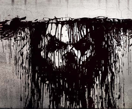
Even though 'Sinister' (2013) has only been out for a couple of months, this image has become a well know icon for this film. You cant fully depict what or who the painting is but because of the popularity to its demographic it is highly and easily recognised as the villain of this modern 2013 hit horror film. The use of the dark colours have huge connotations towards the film as it shows misery and could foreshadow 'distraught' and 'blood filled' events that may occur. For their branding icon they decided to use this image as it occurs multiple of times in the actual film as well as the trailer. It's the one image that can summarise Sinister.
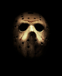
This is the iconic mask from the film 'Friday the 13th' (2009) where Jason, the villain, uses this mask as a defence mechanism as well as a sinister way to protect his hideous distorted identity. The way the light beautifully shines on the mask reflects a silhouette of a 'figure' behind the mask, it creates a question of who is behind the mask and whether they are a 'man' or a 'monster'. Which follows the narrative of the story where we find out that Jason is actually deceased and basically 'came back from the dead'. It seems to be as followed that the effective branding is most commonly the thing that scares us the most when dealing with the genre of horror. It leads us to the conclusion that the idea of the brand is to have the most iconic image from that film.
Font can be used to enhance the films brand. However, we want to avoid this as we want to keep it as minimalistic and simplistic as possible. For example;
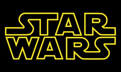
'Star Wars' was a massive cinematic film in the 70's and onwards where the same font has been used through out each and evert film ever made by George Lucas. Due to this, the audience has overseen the villain Darth Vadar or the protagonist Luke Skywalker and has payed more attention to the type of font rather than any of the main persona or props. Star Wars has adapted that style of font and made it their own by using it in every motion picture. When you see this font, even though it's stating it's title, you already realise which film is it without even really seeing any of the main characters.
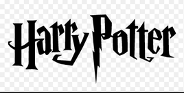
'Harry Potter' is a massive phenomenon which is ironically made in Britain. It is ultimately another example of where the font is the main brand of the film. This gives an unusual feel to brand identity and seems to be quite unrealistic as you'd normally associate 'Harry Potter' with the main three protagonist and the villain.
Other Coursework Posters And Magazines
Being about the women 'Bloody Mary' the group who created this teaser trailer decided to use her as the focus of the poster, they also included a bit of red text to draw the audience in. We took some inspiration from past course works magazine and posters. We are using a similar idea to "Annika" 's posters of the bath tub over flowing with blood. We wanted blood in our magazine as it relates to the vampires in the trailer which drink blood.
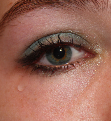
Original imageThis is the original image that we used for our poster. To create the tears we dripped water in Kirsty's eye to give make it seem like she was crying.
|
Final Poster
This is our poster draft, we have gone for the iconic red to symbolise the danger and blood that comes with the vampires. The rest of the poster is in black and white to draw more attention to the red. Initial Poster Design This is the initial idea for our poster in which the image is in full colour, we found that this image was not as effective as the red of the blood and the eye do not have as much as an impact as the black and white image which became our final poster idea. |
This is the original image that we used and photoshopped to make the eye and the tears red.
This puzzle was created using a site called Jigsaw Planet.
Poster
Requirements
A2 Media Studies required the group and myself to create a teaser trailer of the genre of horror. This also included the ancillary task of making a poster and magazine cover for our ideas for our film. I researched the significant codes and conventions of horror magazine and poster in order to expand on the audience demographic effectively and efficiently.
After thoroughly researching and analysing posters, the main purpose is to simply grab the spectators perspective, and also provide people with information. Sometimes posters are designed to make the spectators curious about something, and encourage them to seek out further information of their own accord.
Movie posters are also used to advertise an upcoming film; through letting audiences know that a new film is due for release, which raises awareness and in turn aims to generate adrenaline A film poster provides significant information on an upcoming film such as; the name of the film, the release date, the stars/actors and actresses who are in the film and the BBFC certification.
Chloe Young
Analysis
|
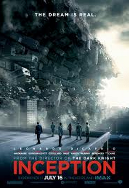
TitleThe title remains at the bottom of the poster, drawing the audiences attention to the characters above, following the action rising above the title. The title stands almost like a platform, metaphorically speaking it indicates irony as the characters are not in a stable position, due to the action and buildings about to fall on to them. The fact that it is the colour red helps bring images to the foreground and foreshadows blood shed.
SloganThe Slogan is short and precise, targeting the audience's minds which causes them to think on behalf of the meaning.
PhotographThis main image has used special effects in creating the background of the buildings going vertically towards the sky and in front of that are the main characters in the film, with the most important at the front, as it is the protagonist that is conventionally central. When we see this image of the street curving, we can figure out what type of genre it is, and we also see it’s something different that you usually wouldn’t expect, which is why it entices the audience, absorbing the purpose.The colours focus mainly on a light blue spreading to a darker blue this making it seem more like a film and less like real life. The seven characters in the poster become the iconic brand with the action surrounding them.
|
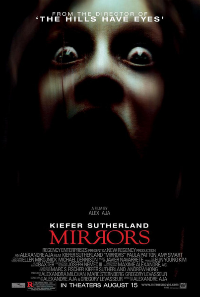
TitleAlike Inception, the title remains at the bottom of the page, which I find centralizes the image significantly. This is something we used in our overall poster, as these posters where brought to our attention and contotated positive purposes, therefore we took homage from having the title remain at the bottom of the poster. The 'R' reflects each other to create a literal sense of the capacity of a mirror, reflecting one another.
PhotographThe photograph emerges from the darkness with a blurred overlay, giving it an authentic touch which may foreshadow events in the film, allowing the audience to question the poster. The centralised girl almost looks like a victim with her eyes wide open, and her mouth, dark as if she was screaming. By having the girl as the main brand, draws in their audience demographic of the spectators who are drawn to the genre of paranormal, as it is seemingly 'ghost' like. A close up, I find has a more artistic approach, and portrays fear almost immediately from a young looking- vulnerable teenager.
GenreAs a group, we knew a close up of an eye would metaphorically suggest the genre of a demonic yet seductive theme. The redness immediately catches the spectators eyes, allowing them to be drawn in, questioning the secrets behind the tears of blood.
|
|
Magazines
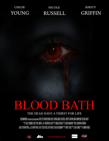
We decided to include the concept of blood and gore in order to highlight the genre of a seductive slasher. The female vampire in the centre has blood surrounding her as if she is discreetly bathing in her own luxuries which takes immediate effect when associating with the title 'Blood Bath', alike 'Mirrors', having a metaphor in order to make the title literal. By the blood overlaying a simplistic white background also portrays a sense of irony as white is contrasted to evil. The use of irony presents the magazine in a mocking manor, almost as if to patronise the audience alike the victims we encounter. Below, there is brief feedback we received for our magazine, most positive which was conceived in the lesson when presenting our products.
The Vampire becomes our brand identity in the magazine, as it enables to reinforce the theme of promiscuous acts of torture, adapting and convincing our audience demographic of men.
