Effective Movie Posters.
Scream 4.
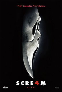
- I find this poster effective as it has simple little things that make it stand out.
The way that the mask turns into the dagger is creative, and having it on a solid black background also works well as when ever the killer attacks its always at night when its dark. - By Kirsty
Friday the 13th.
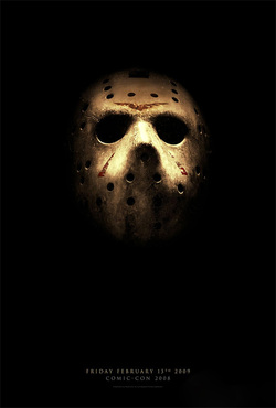
- This poster is effective as it is simple.
the simpleness of having Jasons signatures mask as the only thing in the poster surrounded by darkness is effective. - By Kirsty
Let Me In.
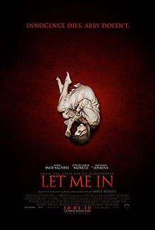
- I find the poster for 'Let Me In' both effective and ironic.
The poster is effective as the girl in the poster is all alone and isolated.
I find the poster ironic as she is well lit which she can never be. - By Kirsty
Carrie (2013).
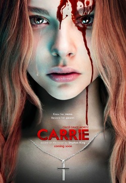
One of the aspects of this poster I find particularly effective is the way the blood is running down the right side of her face like a tear, which contrasts the left side where there is a real tear.
The use of blood on her face is effective as in the movie it is the use of blood which causes her to become evil when it gets poured on her.
The title is also in red to stick with the theme of blood.
By Kirsty
The use of blood on her face is effective as in the movie it is the use of blood which causes her to become evil when it gets poured on her.
The title is also in red to stick with the theme of blood.
By Kirsty
Drag Me To Hell.
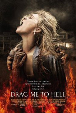
The use of a dull background in this poster is effective as it does not draw your attention away from what is in the foreground. It also contrast the foreground as it has no colour in it, unlike the foreground.
it is also effective as the image relates to the movie title as we see a young woman being engulfed in flames and flames are traditionally associated with hell.
By Kirsty
it is also effective as the image relates to the movie title as we see a young woman being engulfed in flames and flames are traditionally associated with hell.
By Kirsty
By Chloe and Nicole
Scream 4 (2011)
Saw (2004)
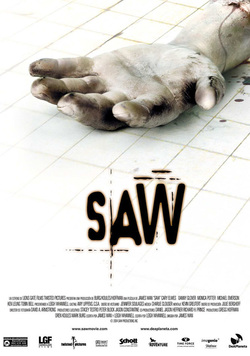
Saw (2004) Blood and hole through the Saw is a very disturbing series of wrist, perhaps a representation of films about self discovery through Jesus with stigmata, that these horrible circumstances. Despite it people die for their sins seeming very exploitive from the start due to the graphic depictions of violence, it does have a very clever message about appreciating life A rotting arm is the main image featured on the poster, a symbolic trademark of Saw and also a hint as to what its major themes will beHospital or bathroom tiles on the (self mutilation)floor, conventional setting for a film about torture. The white floor is odd for a dark horror film, but you can see Monochrome colour the dirt within the cracks, perhaps a scheme, back to basics message that Jigsaw can see the dirt within humanity, that we don’t appreciate the cleanness of our lives and don’t appreciate it, which is the The Saw text is written major message behind the film stylistically, meaning that the audience will quickly be able to recognise the films brand. It contrasts with the white background. The name Saw is also short and memorable This is most likely a teaser poster for the film, as it doesn’t give much information on the film, and doesn’t hold some of the conventional film Conventional Footer Information poster feature, such as cast list, tagline etc.
Sinister (2012)
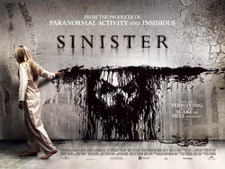
Sinister (2012) With its masthead it names popular recent horror films in the hope it will Sinister is one of the more recent attract similar audiences from these popular horror films, that was films. Even though only a few released in 2012 members of the crew from these two films woken on Sinister, the inclusion of these big brand names helps garner fans of these films, who will expect Stylised title, constructed to keep the same level of shocks in fitting with the sinister themes of the filmLittle blonde girl, connotes innocence. Tagline under the title, a declarativeShe is wearing pyjamas which further and unnerving statement which is gives the image of her being innocent conventional for the genre and childlike, but this juxtapositions with the blood on the wall, constructed to unnerve the audience. The theme of innocence (Particularly children)becoming corrupted by evil is a Picture on the wall, made from common feature of the Horror Genre, a blood which denotes there will be classic example being the little girl in gore in the film. This also shows the classic horror The Exorcist the face of the main antagonist of the film. The face seems to be staring at you, helping you to feel like your part of the horror Monochrome colour scheme, unfolding and to unnerve and conventional for the Horror Genre shock the audience As we now live in a more media literate age, in he footer there is the inclusion of the Twitter and Facebook widget, helping potential audiences to access more information on the film multimedia on the major social networking sites. The coming soon sign adds anticipation to the films wide release.
More about Nightmare on Elm Street (2010)
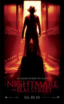
This horror movie poster shows the audience that it is a horror due to the dark colours used within the image are dark and red, these colours represent horror in the way that red is seen as a colour for anger and blood so it is a good colour to be used within a horror poster and black is seen as the unknown, not knowing what is within the darkness. The image of the character alone is fairly scary so the audience can see that this is a horror and because there have been a few films so the audience will instantly know what the film is.The text in this poster shows a tagline saying “welcome to your new nightmare” this refers to the film because the film is about a serial killer that attacks you in your dreams the font of the title is typed in a blunt and formal style so the audience can easily read the words and it makes it look eerie.
By Nicole Russell
The Sixth Sense (1999)
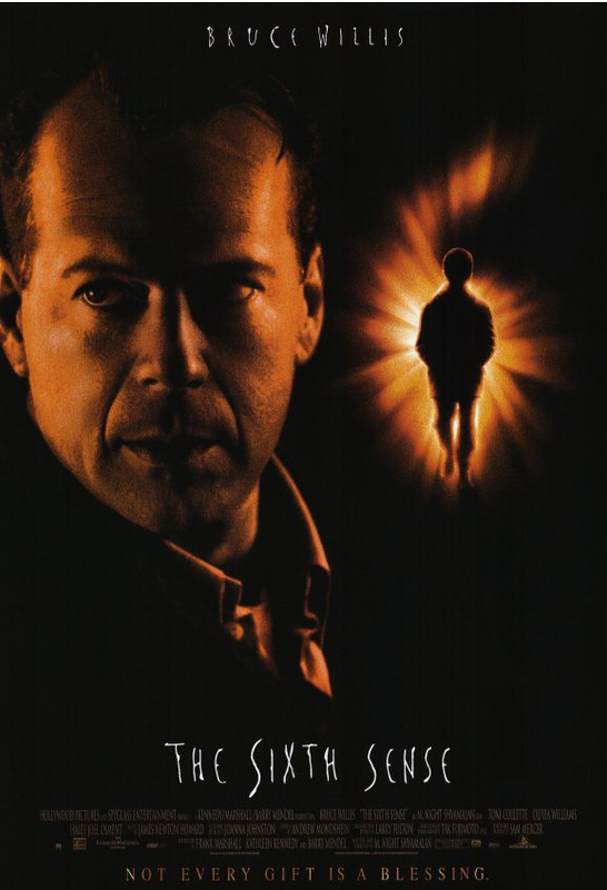
The reason why I chose this poster to analyse was because I have taken a liking to the colour and the mystery behind the title and the image, the specific schedule of three colours indicate a fiery and deep story.
The Background
By using the colour black this connotes death, mystery, suspense, horror and danger, it is also a colour that fits the convention of the horror genre and is used in all movies in some way to create fear within the target audience. The background also allows for the characters on the poster to stand out and for the eye to be drawn to them, this works especially well for the image of the boy on the right hand side that is emerging from a glow, by using a dark background it helps to emphasise certain elements on the poster.
The Text
The actors name (Bruce Willis) has been placed at the head of the poster, it is singled out and although there are other actors in this film the production company have chosen to only have his name present within the marketing product. The effect of this is to draw attention to him as an actor; he is a very successful and has starred in many other popular film titles, this will encourage people to watch ‘The Sixth Sense’. The colour used for this particular text is in white which works well to contrast against the black background making it stand out for the intended audience.
The Title
‘The Sixth Sense’ situated towards the bottom of the poster stands out however does not draw your attention away from the main image. It uses a font which looks like handwriting, maybe of a child’s level of writing as it is spaced out and the lettering is uneven, this infers the context behind the storyline. The font is also very eerie as it looks as though it has been scratched in the poster or written on a white board, this very idea creates images of horror in the audience. Again, the font is white which makes it stand out against the black background.
The image
The dominating image used on the poster is a close up head shot of Bruce Willis, using his image will encourage people to watch this film as again, he is a successful actor which will influence people’s decisions into watching this film. Bruce Willis also has a shadow cast over his face, this is an enigma code (Barthes) which evokes mystery for the audience which works successfully for the horror audience as creating mystery is a typical convention for the genre. Using a close up shot is effective as is captures the emotions expressed by Bruce Willis, he is looking serious and has his head turned away from the image on the right, this infers how the image on the right is something of a serious nature and something to be worried about, this again creates mystery (enigma code).
By Chloe Young
