Ideas for our poster
By Nicole Russell
PHOTOSHOP PRACTICE
In this video I am playing around with the brightness contrast and saturation of an image.
It is a practice for our movie poster and magazine cover.
It is a practice for our movie poster and magazine cover.
|
|
|
|
|
|
|
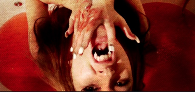
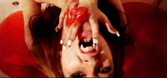
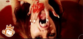
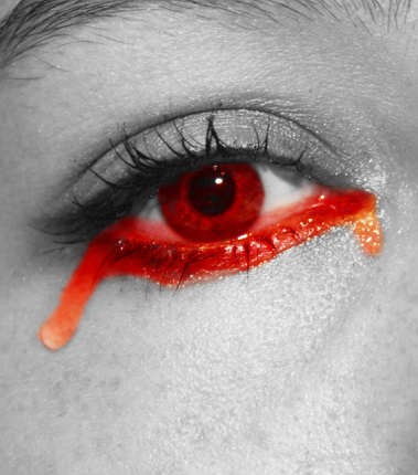
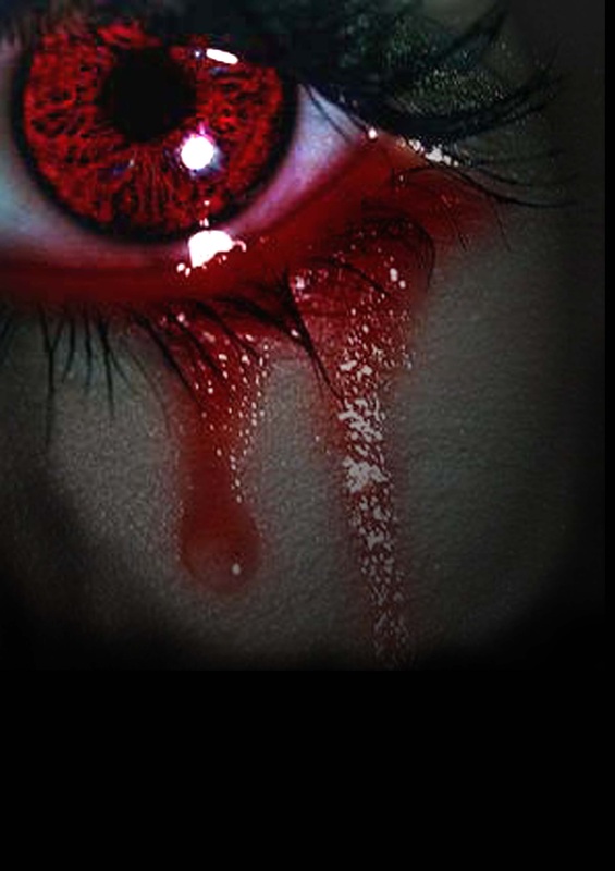
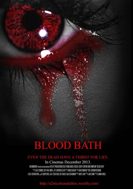
These three images show the use of different technologies, beginning with the original image, to the photoshop edit and finally the picmonkey edit. Picmonkey was better for editing as the blood looked deeper and you could also morph the mouth to create a more non human look.
|
|
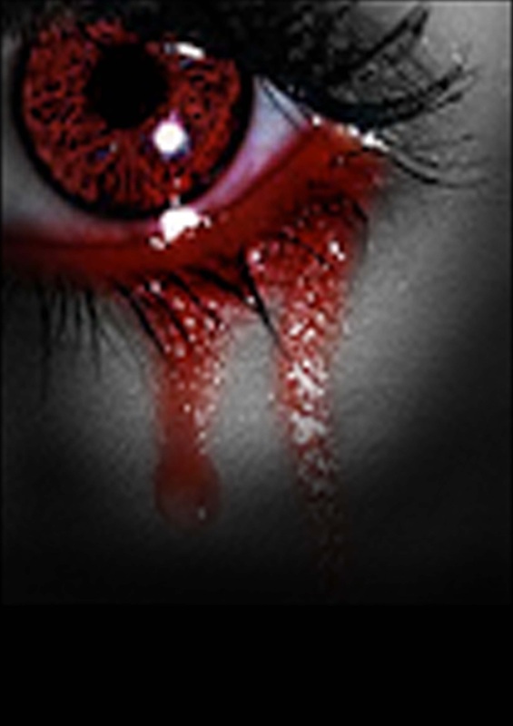
-I change the colour of the eye by using Layer- New Adjustment Layer- Colour Balance and changing the colour in the selected area which was selected using magnetic lasso tool and click the area around the iris. I then used the smudge and blur tool around the edge to make blended and not a harsh line.
-When I photoshopped this image I used the brightness and contrast tool to make the blood brighter than the original and made the rest of the image darker.
By kirsty.
-When I photoshopped this image I used the brightness and contrast tool to make the blood brighter than the original and made the rest of the image darker.
By kirsty.
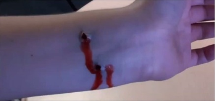
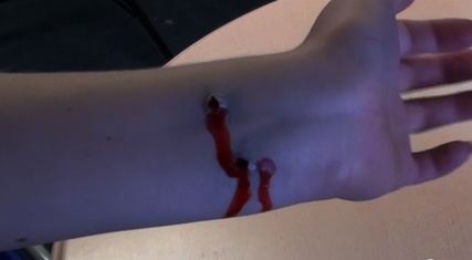
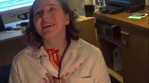
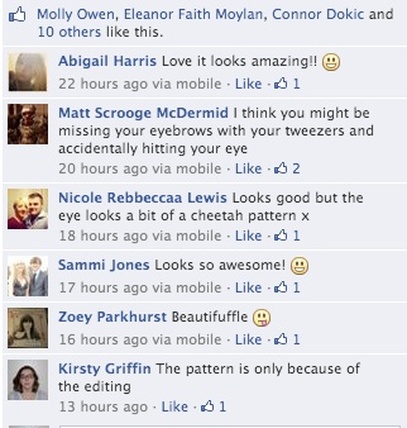
As you can see in the video below the whole progress of getting the image for our 'Blood Bath' poster was very challenging for us as my eyes were very sensitive due to the water going in to my eye, as it constantly made me blink. We overcame this by taking close precautions with the pipette and slowly getting closer to the eye making it look like I was crying. Not only did this take a long time to get correct but the whole idea of precise and accuracy was taken into account.
By Nicole Russell

|
|
Using the magnetic lasso tool and colour balance in new layer adjustment, I managed to make the eye look like it was crying blood.
By Kirsty.
By Kirsty.
Poster
|
|
After using the burn tool on the poster I decided to play around with having the image monochrome except for the red which became brighter and more visible against the black and white background.
|
|
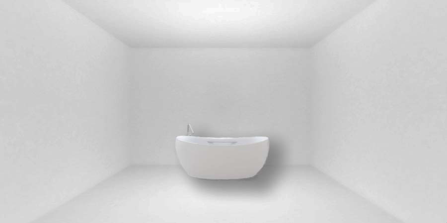
Magazine Experiments.
These are the before and after images for this idea.
|
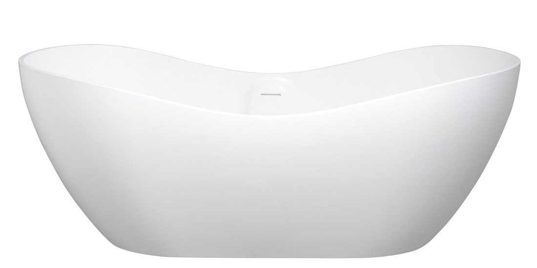
While trying to create our magazine idea, we had some difficulty getting our desired image of just a plain room with a white bath tub in the centre so we had to create this our selfs using two different images. This then posed as an issue as we had to make the bath look like it was actually in the white room. Using the drop shadow effect in photoshop we managed to make the bath look like it was part of the room. It still needs a bit of tweaking but we are starting to get our desired image.
|
By Kirsty.
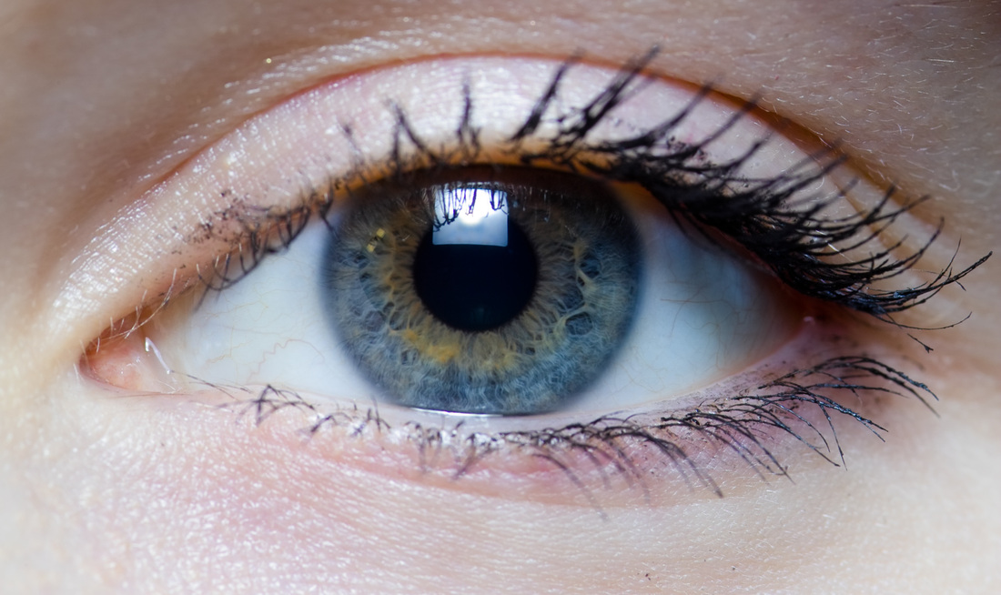
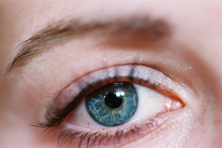
Changing Eye Colour
|
Before
|
To the left is the original picture of an eye. As you can see the eye is not horror orientated whatsoever, therefore we need to change this, as blue is seen as a happy and calming colour which is not involved in the genre of horror.
The eye looks to pure and innocence, so we are going to change this into a more of a killer suitable eye. By Nicole Russell |
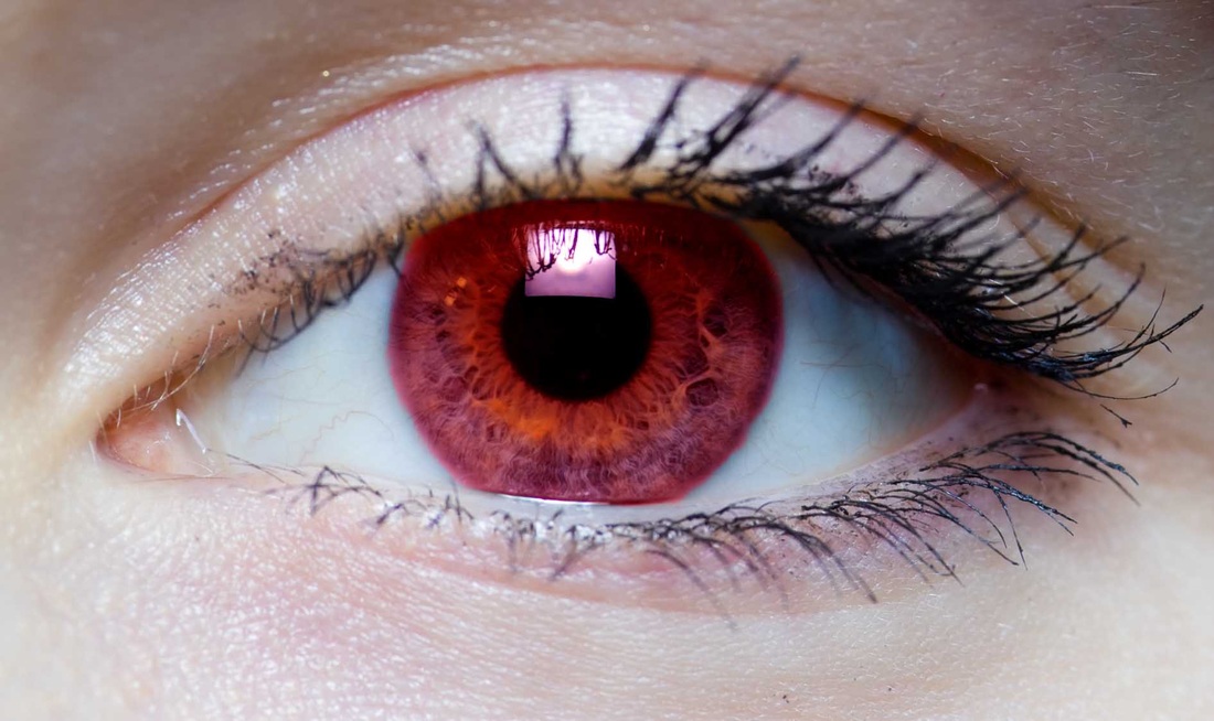
After
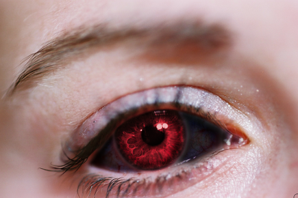
This is the final image of the edited eye, as you can see it is completely different to the one above. The colours are significant as black and red are seen as effective horror orientated colours. The fact I used red and is to show the abnormality of the killer, it suggests that the killer is either infected with a zombie infested disease, a nuclear infection or a vampire orientated horror film. The use of the black also gives off an mysterious atmosphere from killer creating a sinister feel as well as making the audience feel on edge due to the level of their comfort zone.
By Nicole Russell
By Nicole Russell
|
|
|
Bloody Lips
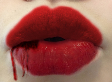
With this photoshop experiment, I attempted to create bloody lips as if a vampire has just bitten a victim. I did, however at first, have a lot of difficulty with perfecting the blood concept, even though I was following a tutorial, I still found it highly confusing. Even though it looks quite unrealistic, it would still be effective to keep on trying to improve it and make it seem finalised and perfection. The use of the red lips is effective as it meant all I had to do was darken the areas on the lips in order to make the blood look dried and old, with the fresh blood dribbling down the rest of her mouth. The fact the blood looks darker than the lips gives it a more realistic feel as blood isn't bold and bright, its more dark and almost infected.
By Nicole Russell
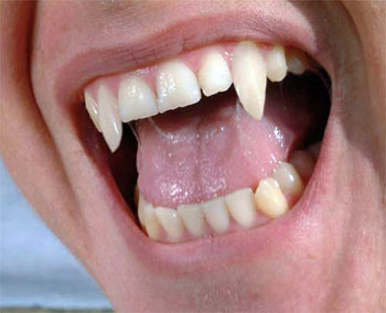
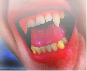
Before After
|
|
I personally like the image edited on Photoshop, it has that dry dark blood effect and that rotten yellow teeth to highlight the blood recently eaten. I also would like to use the method of darkening the background with using levels, I think it is extremely iconic to horror and it is done effectively on the photo on the right hand side. However, it does have its flaws, as although it is a small image, the saliva coming from the mouth needs to go, although it may be because it is a closeup shot which is something we want to avoid for our magazine and poster, we will further experiment with editing mid-shots of vampires to see if it turns out similar to the above. I would also like to darken around the light areas of the face so it gradually builds up to only the teeth being the main focus of the photo. There are many other websites that enables us to edit photos for free with such profession, as they provide genuine filters which are instant, although the websites will only be used it needed. An example of this is 'iPiccy'.
By Chloe Young
As you can see above, there are two similar pictures but edited in different ways. The first picture is my personal favorite as it looks highly matte and perfected, with its simple black and white effect creates a professional chrisma which is vital for a magazine, it also presents a vintage theme running through the magazine. It would appeal to both gender demographics, however mostly males, as it is stereotypically said that males are attracted to the sensuality of films, for example where Laura Mulvey defined the 'Male Gaze' she stated that men typically stare a women because of their attraction, this is why we decided to do this as it will most likely make more money and profit.
With the second image, there are positive aspects as well as negatives. The positives are that the eyes are really effective with the colour red standing out beautifully complimenting with the pale skin making it also seem very materialistic and almost 'perfect'. However, it can be said that we used airbrush a bit too intensive as it can be said it looks too artificial and is in need of toning down a tad. The image itself look a bit fake with its 'vampire fangs', the villain further away from us, has quite realistic teeth but however in comparison with myself it looks as if someone has generally gone on 'liquify' on 'Photoshop' and pulled my teeth down as well widening my face, making me look like a teletubbie rather than a vampire.
In conclusion, my opinion is that I think the black and white is the most effective one for a magazine front cover.
By Nicole Russell
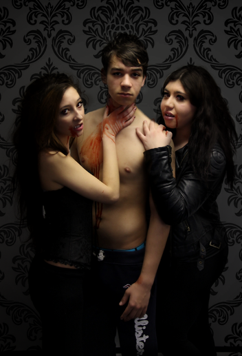
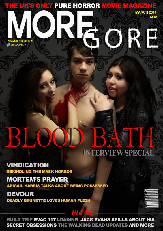
For our magazine, we decided to obtain a black vintage background scheme to synchronise with our provocative theme of sub genre. The use of the male victim being topless creates our demographic audience for our horror as it highlights the sensual atmosphere throughout our trailer. The whole dark scheme creates the right vibe for the rest of the movie. This image allows the audience to contemplate about what the actual film will be about therefore making them want to go and watch the trailer and finally the film. With the females we decided to wear all black to stick to the major horror conventions as well as being the villains. Black is highly metaphoric with the use of black relating to death and misery. Ultimately due to our state of being aka Vampires, we are simply undead, which is why black works perfectly.
By Nicole Russell
By Nicole Russell