QUESTION 1:
In what ways does your media product use, develop or challenge forms and conventions of real media products?
Conventions within our Costume, Props and Makeup
|
Typical conventions in vampire films which we followed:
An advantage of neck biting is that if you film it the right way, you don't have to actually see teeth going into skin, you can just see a head on a neck and it is presumed. In our trailer we purposely went out a bought fangs for our trailer as without it, it would have made the trailer seem more human rather than abnormal. 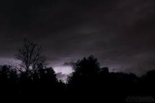
|
How we conveyed it in our trailer:
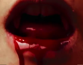
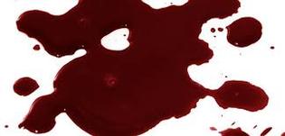
In this image above, you can see a mouthful of blood in which we stuck to conventions as vampire feed on blood.
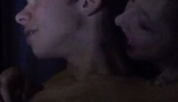
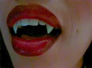
In this image you can see the villain about to bite their victim. This once again sticks to conventions as it follows the stereotypes of a vampire and how they survive. It also indicates the sensual theme through out our trailer as it 'neck biting' is normally associated with promiscuous activities.
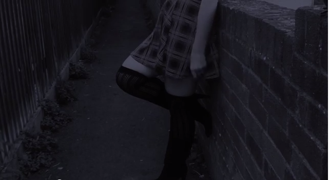
This image above is where we attempted to make the shot look like it was filmed during the time of 'dusk' via Final Cut Pro. This turned out to be quite effective as it generally looks like it is going into night time. We did this by going into effects of Final Cut and selecting 'Day into Night' and then an 'Ice Blue'.
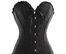
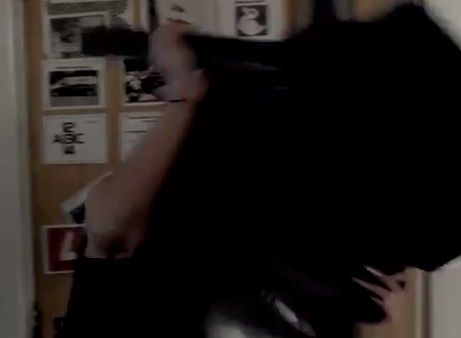
As you can see our cast member, Chloe Young playing the vampire is wearing a corset. This is to represent the seductive yet suspicious theme in our trailer. It also indicates darkness and morbid personality of our villains, which we portrayed perfectly within the shots of our trailer.
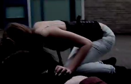
The image above, shows the strength of our vampires which shows how indestructible our villains are.
|
Trailer
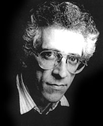
Image above is of Todorov.
Our genre of vampires absorbs themes of promiscuous/ seductive women. We decided to cling onto this convention as there were only females in our group and the vampire genre has not been seen recently by viewers. 'Lesbian Vampire Killers' distributes comedy with an ancient background of blood thirsty vampires who are of course, lesbian. The fact that they are lesbian indicates that they are making a mockery towards the genre which transforms it into a slasher/comedy. Although, since our task evolves around horror only, we decided to take homage from the seductive vampires although only reinforce destructive females who enjoy the pain they inflict of their victims. The binary oppositions helped show the evils that the villains hold over their innocent victims. The males are particularly vulnerable in our trailer, by using a spot light helped draw out a suggestion of purity and goodness that evolved around the victim. The equilibrium spirals out of control as the soundtrack and lighting intensifies and the shots speed up, reflecting the horror genre that develops with fast pace.
Conventions we followed:
Soundtrack: In most horror trailers the soundtrack begins as dark and eerie, and then crescendos into heavy base.
Shot: A disturbing shot of someone being hurt/killed
Editing: The editing becomes more apparent; faster pace shots
Fade: Fade to black to create suspense.
Shot: A scare shot at the end of the trailer
Lighting: Darkened to illuminate blood and to disguise day light.
We challenged conventions by dominating female over males and having the male as the victim, although usually it is the fragile female who is the naive victim. Looking further into stereotypical trailers, not all follow a narrative although the film will of course have a storyline. Narrative theorist Tzvetan Todorov states that most films follow a narrative theory. His theory goes in the order of;
-State of Equilibrium
-Disruption
-Recognition
-Attempt to repair disruption
-Return to Equilibrium
Our trailer;
-State of Equilibrium
-Disruption
-Recognition
-Disruption
-No return to equilibrium
I have personally used elements from Todorov's theory, although there will be no return to the equilibrium as we need that to be a mystery. There is also no attempt to repair the disruption as we aim to hide the protagonist as the protagonist may not leave the audience guessing on behalf of inevitable events.
Posters
|
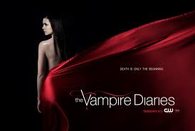
This poster shares a significant amount of common ground with our overall poster as it has three of the most connotational colours that the media consists of. It highlights the promiscuous themes and the quenching of the blood that the 'vampires' suck, in an abrupt way. The half naked women is surrounded in a silky red blanket suggesting that the blood that she typically takes from humans is keeping her warm and alive. The darkness surrounding this potential villain suggests the mystery not only around her but around the storyline itself. The title is pure white which is very connotational towards the theme of innocence which we do not want to suggest in our poster, as ours does not consist of any type of 'romance' between the villain and protagonist.
|
|
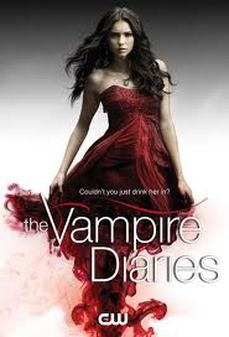
This poster of vampire diaries is essentially different although it uses the same conventions in order to portray the genre. Non naturalistic aspects are drawn to the audiences attention by the woman emerging from dark blood looking as if it is smoking up to a lady in a red dress who looks seductive. The redness intensifies the poster as it is able to stand out around the bold colours of black and white. This is something we took homage to when making our poster. The fact that the bold colour of white fades up into black suggests the inevitable downfall of vampires, achieving its aim to be a mystical sequence of tragedy and love.
|
|
|
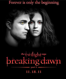
'Twilight' is a phenomenal and tragic sequel where a human and a vampire inevitably fall in love, achieving the impossible. This poster foreshadows 'Bella' the central character to turn to a vampire as a last resort of living as she gave birth to a vampire baby, that lives of human blood. The poster shows the two main character with pale faces and reddened eyes, showing the conventions of vampires. Although instead of using the bold colour of white, they used grey to specify the suggestion of coldness and plain disappointment, showing that there is a grey area to the narrative. We decided to take homage to the bold red titles and the grey fading into black as it aims more towards looking realistic then the one above.
|
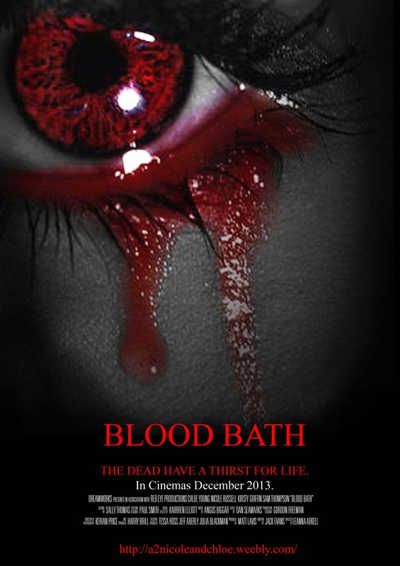
Our poster;
- White, Grey, Black, Red (Colour Scheme)
- Closeup of the eye
- Fade out
- Suggestion of blood
With our Poster we have also challenged conventions with the stereotypical image of Vampires, even though we have conveyed the idea of blood which is what Vampire feed on, we have had a different approach to this by creating an unusual sense of abstract by having the blood pour out of the eye instead of the mouth which is seen commonly in Vampire films.
Posters
Movie and past course work posters
For our poster we followed quite a few conventions and took inspiration from other movie posters including past course work posters.
Our poster
We went with the idea of having a close up on the face for the poster but instead of having anything in the background we had just the crying eye surrounded by black. We decided to had the only colour in the poster be the iris of the eye and the tears which were both turned red. This is commonly used in posters that aren't always horror, it is a simple artist trick that is designed to draw in the eye of the audience.
As our horror trailer is about vampires we wanted to incorporate red to symbolise the blood and danger. We decided on a close up of the eye because conventionally vampires eyes are red, silver or bright blue as shown in 'Underworld'. We had the red tears to show some of the innocence in the vampires as they can't help what they are and what they feed on.
For our text we decided to go with white and red to again symbolise the blood and danger and the innocence.
