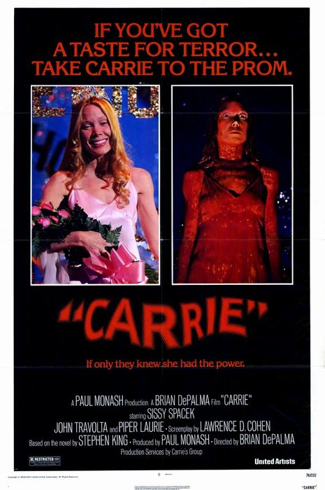
Original Carrie Poster
Planning
We decided to film Sam so we could capture the most significant shots on our editing software.
We chose to film in the drama studio because we were able to make it naturally dark. It was also a huge alternative as we could see what lighting looked the best.
We focused on body language and facial expressions in order to portray the character of Carrie's emotions and establish the correct theme of darkness.
By Chloe Young
We decided to use a black room to metaphorically convey the dark themes throughout the trailer and film. The use of the singular spotlight on Sam was effective as it showed that she was the central character in this narrative. It also creates shadows on her face which creates a sinister episode to this poster creating. We decided to cover half her face in blood as it foreshadows what occurs in the actual film making the spectators want to watch it, furthermore it creates a personality to our Carrie and allows the audience to make assumptions about her.
By Nicole Russell
By Nicole Russell
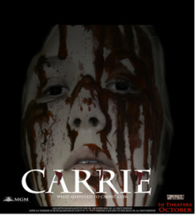
Overall Poster
We took many different pictures of Sam after having painting her face and fitting her costume. Overall we decided to chose this poster. This is because it looks sinister and conventional as many horror posters show a closeup. The darkness around her emphasizes her dark personality, it also highlights the fact that she is frustrated and angry and see's nothing else but darkness. Her open mouth illustrates vulnerability, however she is not shown as vulnerable or naive when the big event happens which we have chosen to hint in our poster. Regardless of the genre of a poster, they all show a subtle hint and hidden messages, which we mention in our video on our analysis of posters. However, we were reluctant on giving away the setting as it is too basic and the fact that it is prom may illustrate a calm and welcoming atmosphere, however we want a disturbing and thrilling theme to draw our audience in. By analyzing posters also enables us to see what needs to be on there such as the production company 'MGM' along with a website and the release date.
By Chloe Young.
By Chloe Young.
|
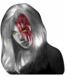
This was the first edited picture we tried to construct of Carrie. At first we thought this was a good idea as the yellow tinted eyes suggest an evil and sinister approach from Carrie due to the events that happen to her. The yellow also portrays an uneasy or un natural feel when looking at our center point of Carrie.
The use of black and white, at first was seen as an effective idea as it not only highlights the blood and the eyes but suggests a split personality as if there's a good side but also a bad. After consulting with the rest of the group and it was highly noticeable that this picture has been edited which isn't what we intended at all. The picture made it look like a zombie or vampire horror trailer rather than a paranormal in which is what Carrie prominently is. It also created an artificial look emphasising the 'fakeness' of the whole picture with the eyes and the black and white mirage does not appeal to the 'Carrie' image. By Nicole Russell |
|
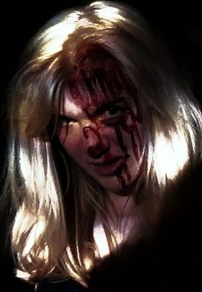
This is another edited idea we had for our poster. The lighting was both dark and bright to help show that she was in a party like environment in which Carries abilities reach a higher level of power.
We didn't use this picture as we felt it was too dark and so you could not clearly see her angered look. Another reason why we decided not to use this for our final poster is because in the photo the dark lighing makes it hard to see the blood which makes it look less effective as the blood is a big and relevent part of the actual movie and a main focus of our poster. By Kirsty |
|
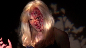
This is the original picture that we were going to use for our poster, we liked it as it was bright and you could see the blood very well. The lighting was effective as it created a good background which made it seem like she was actually at the prom.
Also the fact that only she is lit up shows she has more power because the attention is on her. She has an angry facial expression however her head is tilted slightly down showing her vunrability as she is alone. By Kirsty |
