Font Choices and Justifications
By Nicole Russell and Chloe Young
By Nicole Russell
POSTER
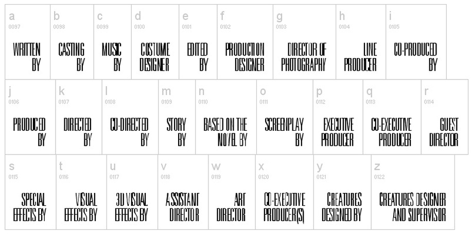
We managed to find this font on DaFont under Universal Accreditation.
(http://www.dafont.com/universal-accreditation.font?text=OVERTURE+FILMS+%C4)
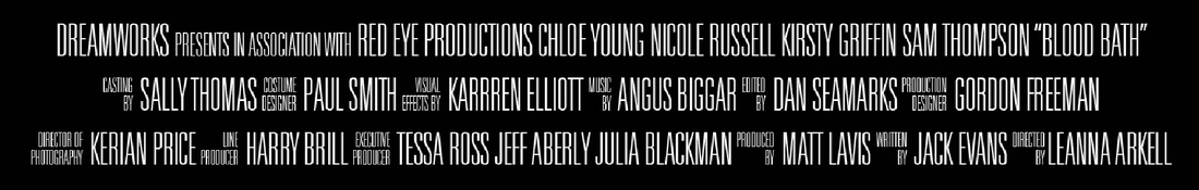
We used it for the credits at the bottom of our poster as they are similar to that of actual film posters.
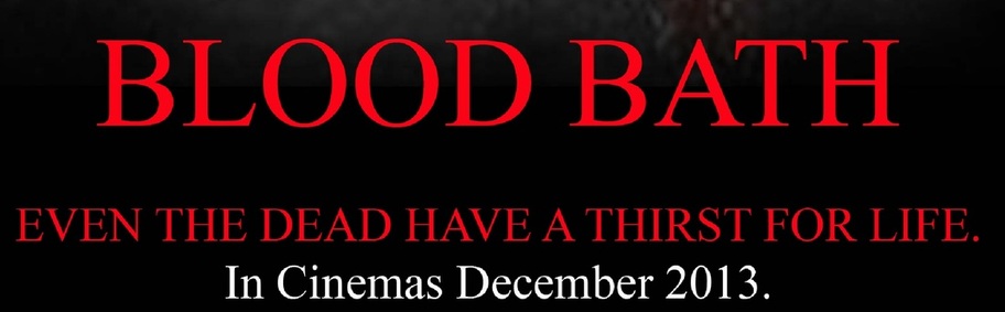
For the rest of the titles we used Times New Roman as we wanted a font that was simple but was effective as well.
We made the the titles red and white to symbolise blood and purity.
By Kirsty.
(http://www.dafont.com/universal-accreditation.font?text=OVERTURE+FILMS+%C4)
We used it for the credits at the bottom of our poster as they are similar to that of actual film posters.
For the rest of the titles we used Times New Roman as we wanted a font that was simple but was effective as well.
We made the the titles red and white to symbolise blood and purity.
By Kirsty.
